

YeShu Packaging Redesign
Adobe Illustrator | Photoshop | Dimension
Year: 2020
Course: Packaging Design 1
Project Timeframe: 4 Weeks
Collaborative Team: Ming Zhao and Angela Lam
Challenge: Redesign packaging for a foreign product to allow them to successfully expand their brand into a new Canadian market without alienating existing consumers.
Disclaimer: This student project is not affiliated with YeShu.
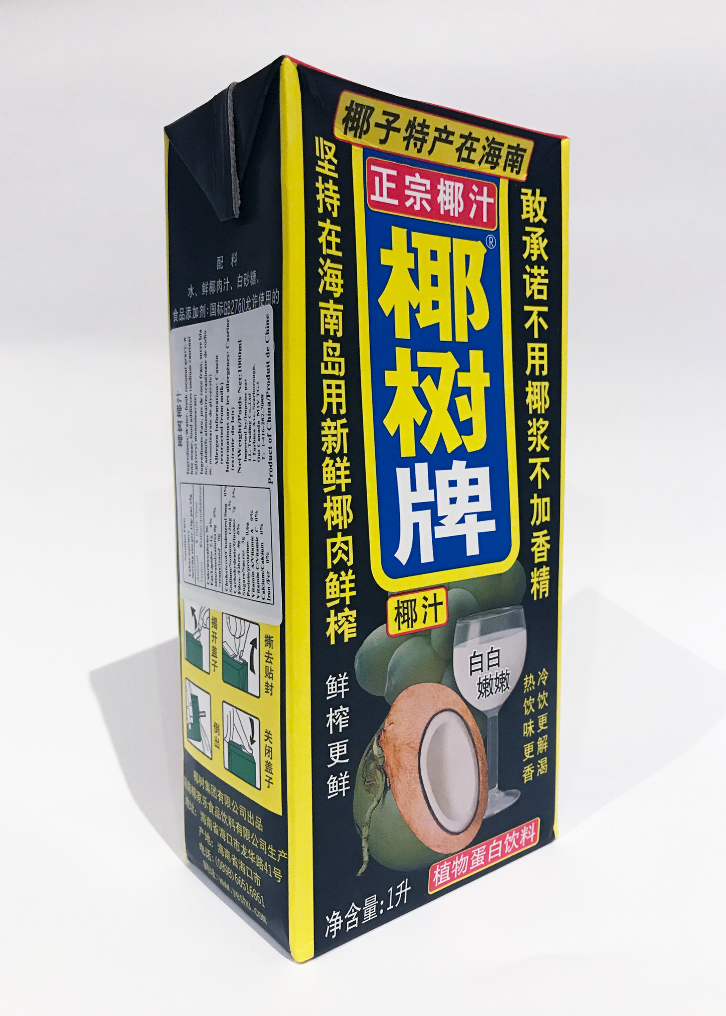
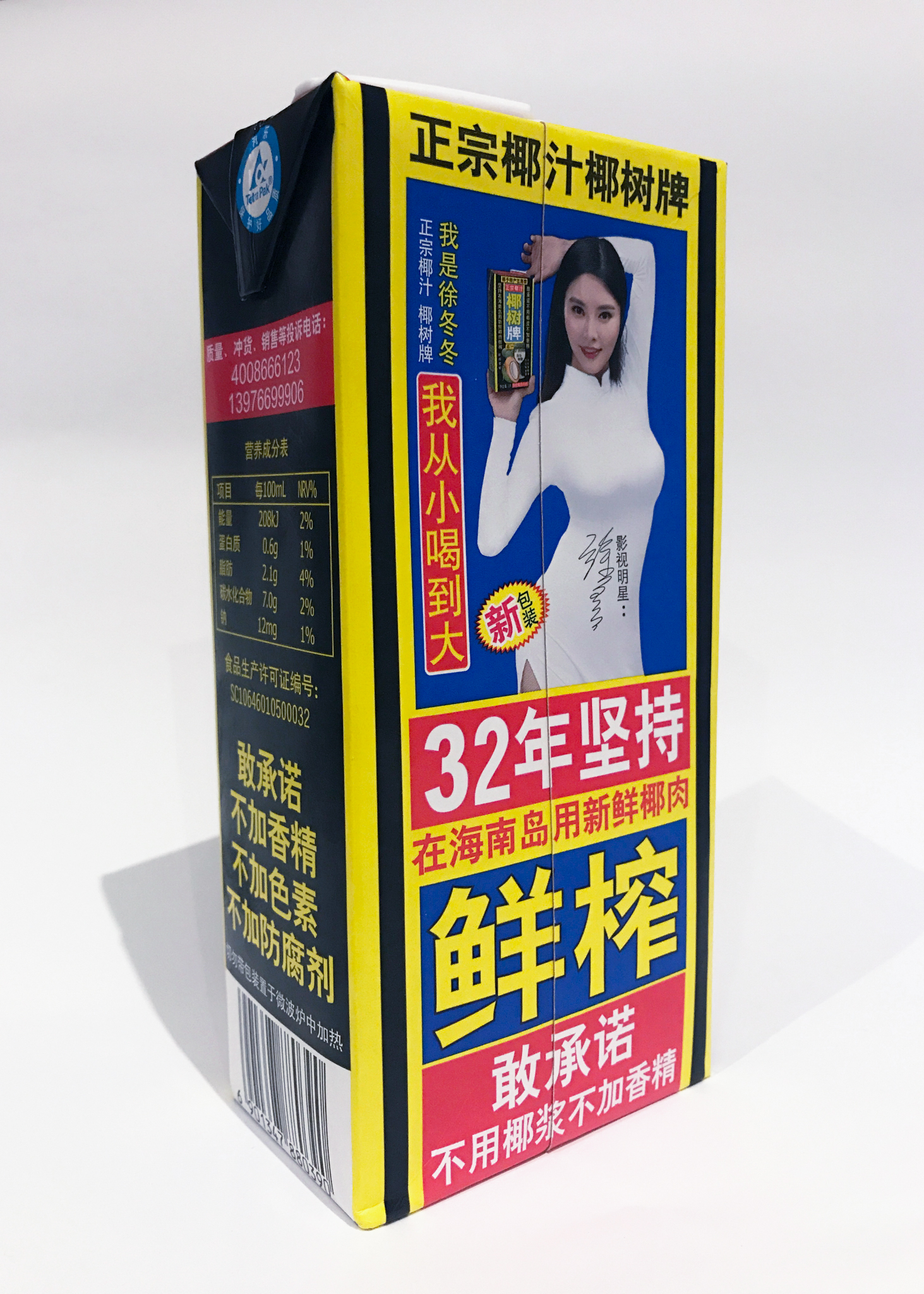
YeShu is a coconut juice brand that was created in 1988 by Coconut Palm Group Co. Ltd. in Haina, China. Although this brand of beverage has existed for over 30 years, its packaging design had never changed and remained the same since 1988.
Although the current packaging design may not be aesthetically-pleasing, the current target consumers residing in China do not mind because they already recognize the brand by its iconic vibrant colour scheme, and the delicious beverage that comes with it.
However, if YeShu were to be marketed to new consumers in foreign countries where Chinese may not be a widely spoken language, many individuals would not immediately understand the contents that are housed within the packaging.
Therefore, even though the current packaging design of YeShu is a success in China, the same overwhelming vibrant visuals may be its downfall if the brand were to expand internationally.
As a result, we came to the conclusion that YeShu’s packaging can be significantly improved in order to attract new foreign consumers (for example, Canada), without alienating its existing consumers.
Despite the fact that reintroducing YeShu into the Canadian market would mean that there would be a completely different target consumer, we made the decision to keep the essence of the original packaging as it helped the product stand out from the rest of the competition consisting of other coconut juice brands.
Other brands oftentimes utilized a white background on their packaging paired with high resolution photographs of the ingredients used in their beverages.
Although the current packaging design may not be aesthetically-pleasing, the current target consumers residing in China do not mind because they already recognize the brand by its iconic vibrant colour scheme, and the delicious beverage that comes with it.
However, if YeShu were to be marketed to new consumers in foreign countries where Chinese may not be a widely spoken language, many individuals would not immediately understand the contents that are housed within the packaging.
Therefore, even though the current packaging design of YeShu is a success in China, the same overwhelming vibrant visuals may be its downfall if the brand were to expand internationally.
As a result, we came to the conclusion that YeShu’s packaging can be significantly improved in order to attract new foreign consumers (for example, Canada), without alienating its existing consumers.
Despite the fact that reintroducing YeShu into the Canadian market would mean that there would be a completely different target consumer, we made the decision to keep the essence of the original packaging as it helped the product stand out from the rest of the competition consisting of other coconut juice brands.
Other brands oftentimes utilized a white background on their packaging paired with high resolution photographs of the ingredients used in their beverages.
Final Dielines (3 SKUs)


The original packaging design for YeShu used the three primary colours (red, yellow, and blue), which made them stand out from their competitors. Since yellow was the most distinct colour that stood out on the packaging, we decided to make it the colour of the new logo. Since using all the primary colours on a single packaging design would be overwhelming, we decided to split them into three different SKUs, while maintaining the modular grid that makes the brand memorable.